


Elementor Sticky Headers with Shrinking Logo On Scroll – Step-by-Step Guide
Elementor has been a powerful page builder for WordPress that continues to grow and evolve. The one main reason I fell in love with Elementor is the possibilities of what can be created without having to code or use intensive development work.
And one of those possibilities I want to show you today is what can be done using Elementor’s sticky header and navbar. Primarily the shrinking logo on scroll effect when the page scrolls down and the logo size changes using Elementor.
Creating a Elementor Sticky Headers with Shrinking Logo on Scroll
Changing the logo size when scrolling down is only one of the many effects that can be done using Elementor’s sticky navbar. The method we’re going to use in this Elementor tutorial can be applied to other scrolling effects. There is the transparent to solid background effect, background and link colors changing on scroll, and you can even switch logos from a light logo to a dark logo in Elementor using the sticky navbar.
We’ll keep it simple in this tutorial and focus on only one thing – How to make your logo shrink on scroll with Elementor using El’s sticky navbar. But still, make sure to check out the other tuts.
What you will need for this tutorial.
To achieve the shrinking logo effect on a sticky header, you will NOT need any 3rd party plugins or widgets. All of this can be made with just Elementor. But you will need the pro version of Elementor, Also you can do with light version if that single page or use the header in multiple page without global section on theme builder area. If you don’t have the pro version yet, bookmark this post, go grab it, and then come back. The pro version of Elementor is well worth the cost for the value you will get. Here is a link to find the pro version.
Step 1: Building a Menu in Elementor’s Theme Builder
Navigate to your templates and select ‘Theme Builder.’ From here, add a new header (only if you do not have one yet. If you already have a header built, go to edit that header template).
Make sure to add your WordPress Menu widget (formally called the Nav Menu widget) and Logo or Image widget to the container you want to stick to the top of your site. It should look something like the image below.
Step 2: Setting Up Your Logo with Elementor
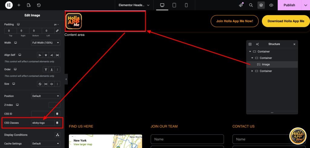
Make sure to use pixels (px) when giving your logo its size. This will help when selecting the size you want your logo to shrink. I normally use REM for most of my sizing nowadays, but there are still situations where PX works best because it’s absolute. This is one of those situations.
Navigate to the ‘Advanced’ tab, and inside the CSS Classes, add’ sticky-logo.’ Make sure it looks just like the image below.
Step 3: Setting Up the Sticky Header & Sticky Navbar in Elementor
Here we will add the sticky effect to your header. The original tutorial video uses the older Elementor Sections, but this tutorial has been updated for the newer Flex Containers.
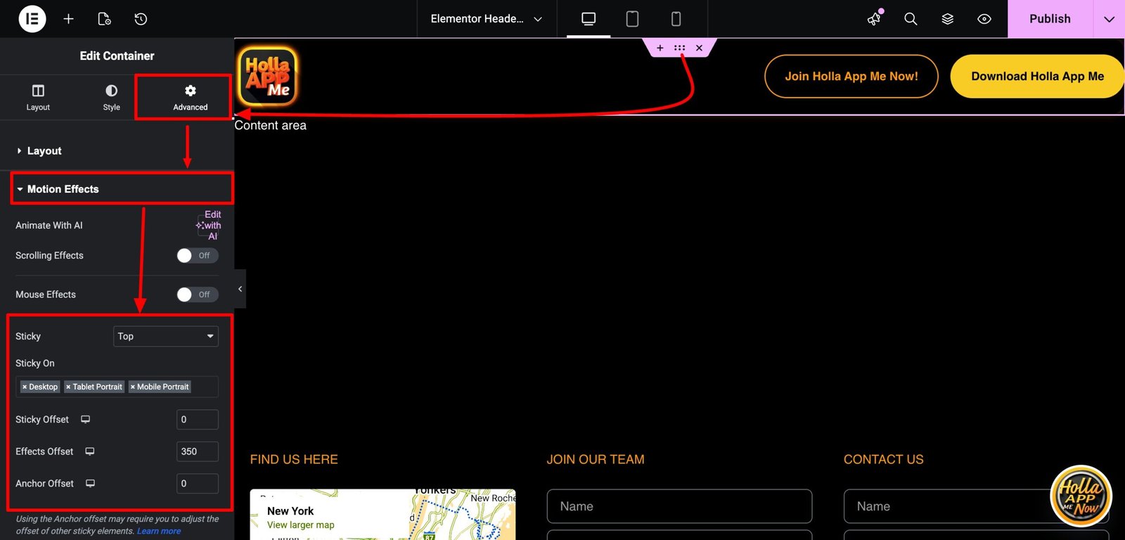
Select the outer container wrapping your logo and menu that you want to stick to the top of the page. Next, navigate to the ‘Advanced’ tab. Here you will open up the ‘Motion Effects’ area. In the ‘Sticky’ option, select ‘Top.’
You’ll notice a few new options open up when you turn on the ‘Sticky’ option. One option is for devices. Here you can choose which device you want your header container to stick on. For example, you might only want your menu to stick on desktop and tablet but want to disable the sticky menu on mobile. Simply click the ‘X’ on the device you would like to turn off.
There will be two more new options, ‘Offset’ and ‘Effects Offset.’ The ‘Offset’ option moves your container up or down. Leave this at 0. For this tutorial, we will not be touching the Offset selection.
What we need to focus on is the ‘Effects Offset.’ This is where we can control how far down the page the effects take place. For example, if you select 100 in the Effects Offset, your effects (in this Elementor’s tutorial, it will be a shrinking logo), your logo will shrink when you scroll 100 pixels. So choose how far you want your visitors to scroll until your logo shrinks on scroll. Just make sure not to leave on 0! If you leave your Effects Offset on 0, no effects will work.
When we give a value to the Effects Offset, a new CSS class is added when scrolling to that value. This is how we can apply effects when scrolling. Your Effects offset should look like the image below.
Step 4: Making The Logo Shrink On Scroll in Elementor’s Sticky Header
We will need to add a snippet of CSS. If you do not know CSS, that is totally fine. Just copy and paste this bit off CSS and I’ll show you where to put it.
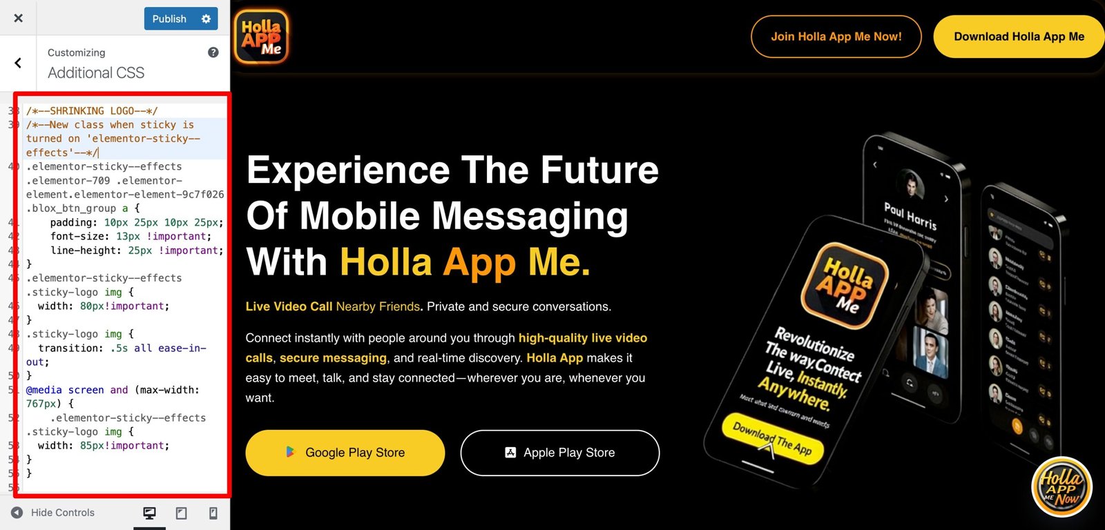
/*--SHRINKING LOGO--*/
/*--New class when sticky is turned on 'elementor-sticky--effects'--*/
/*--give the logo image a class called 'sticky-logo' --*/

.elementor-sticky--effects .sticky-logo img {
	width: 120px!important;/*--edit the pixels to change to desired shrinking size--*/
}
.sticky-logo img {
	transition: .5s all ease-in-out;
}
@media screen and (max-width: 767px) {
    .elementor-sticky--effects .sticky-logo img {
	width: 90px!important;/*--edit the pixels to change to desired shrinking size for mobile--*/
}
}
Navigate to the outer container, then to the ‘Advanced’ tab, and at the bottom, open up the ‘Custom CSS’ area. Here is where you will add the CSS snippet provided. After this, you should see the logo already shrinking when scrolling.
The next step is to choose how much you want your logo to shrink.
Step 5: Editing the CSS to Change the Size of Your Logo to Shrink On Scroll.
There are only three selections in the CSS, and there are notes to help guide you. The notes are between /*notes*/.
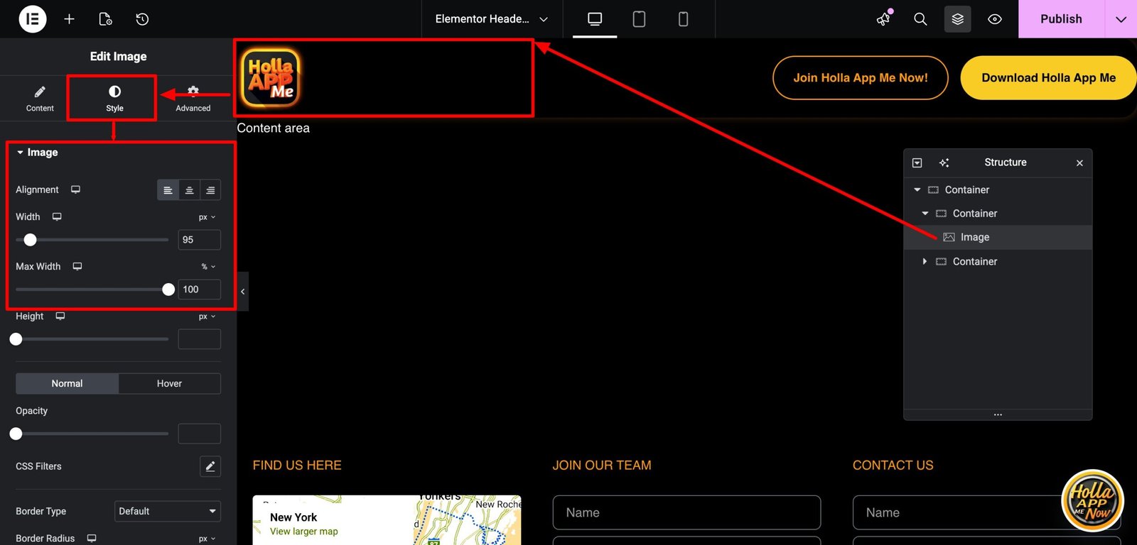
The first section is where to select how much you want your logo to shrink. You will notice it’s in pixels. This is why, in the beginning, we determined your logo size in pixels to make it easier to decide how much you want to make it shrink.
.elementor-sticky--effects .sticky-logo img {
	width: 120px!important;/*--edit the pixels to change to desired shrinking size--*/
}
The second section is how slow or fast you want the transition effect. It is set at .5s, which is .5 seconds or half a second. You can edit this number to change the transition effect. Just change the number. 💡 Hint .2s to .5s is a sweet spot.
.sticky-logo img {
	transition: .5s all ease-in-out;
}
The third section is for mobile. Since you/ll most likely make a mobile version of your menu with a smaller logo, this CSS can make the logo size shrink smaller just for mobile.
@media screen and (max-width: 767px) {
    .elementor-sticky--effects .sticky-logo img {
	width: 90px!important;/*--edit the pixels to change to desired shrinking size for mobile--*/
}
}
The Possibilities of Elementor’s Sticky Headers
There are several ways to add effects to your headers and menus with Elementor. Effects like transparent to solid background headers on scroll, changing the colors to your header’s background, shrinking the size of your entire navbar on scroll, and even switching your logos on scroll. All can be done with the same method using the effects offset.
When using the Sticky effect with Elementor, you can create a class that only activates when hitting the Effects Offset value (.elementor-sticky–effects). With this, by applying a bit of CSS, we can get creative and open up new possibilities. Creating effects like these can make your site extra creative and provide a better user experience to your site’s visitors.